Alaska Airlines
Headquarters
Wayfinding (campus, and interior)
Environmental Graphics
Experience Design
The new development for
Alaska Airlines brought about a
unique opportunity to connect
a group of Alaska Airlines buildings and decades
of evolving brand expression,
into a new front porch to the
organization.
With the purchase of this new site
(deemed ‘Copper River’), Alaska Airlines
solidified their roots in SeaTac, Washington, just outside of Seattle.


Phase I included a freestanding parking garage
and office building (deemed ‘The Hub’), where
prospective and new employees would come
to recieve training and education about the
organization. At the top floor, the building also
houses some of it’s most technical and secure
operations groups which keep the compex
intricacies of a commerical airline running 24/7.
With this in mind, our Experience Design team
set out to create a space that demonstrated
a powerful first impression, and a welcoming
atmosphere to employees and visitors.
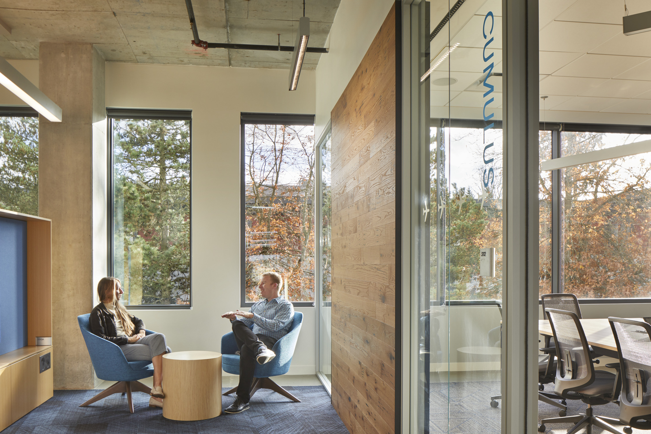
On the interior of the Hub building, brand activation takes place at areas of communal gathering, respite, and vertical circulation. This helps bring to life the architectural and interior design concept of connecting Alaska, by drawing people through the building’s central social/gather spaces.
On the interior of the Hub building, brand activation takes place at areas of communal gathering, respite, and vertical circulation. This helps bring to life the architectural and interior design concept of connecting Alaska, by drawing people through the building’s central social/gather spaces.

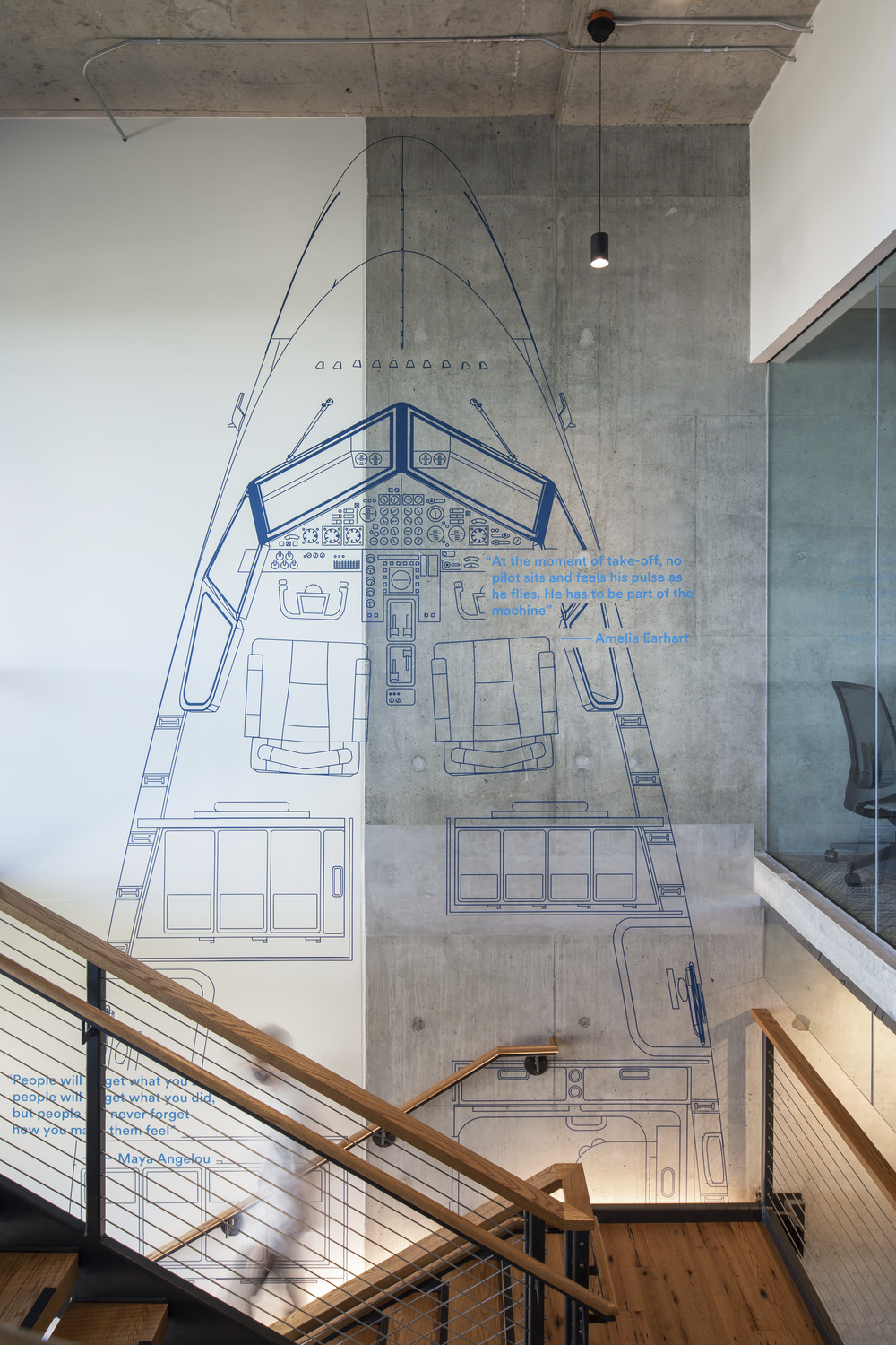
The 737 Max 9 blueprint is a key connecting feature which provides a subtle graphic texture to the space. Beginning at ground level adjacent to the entry and gathering space, the blueprint resides on the concrete sheer wall and follows the main circulation stair up through the six-story building. The vertical orientation and 1:1 scale detail bring into perspective the magnitude of the Boeing 737—Alaska’s most iconic asset in their fleet.


Interior naviagation is inspired by the technical tools widely used by pilots and air traffic control teams, (i.e. aeronautical charts, the phonetic alphabet, areodynamics, etc). We organized wayfinding nomenclature for conference rooms, training and project rooms by assigning techinical names based on levels of the building based on the phonetic alphabet. (e.g. Level 2 = Bravo, therefore rooms on Level 2 were named Bernoulli, and Bulkhead)


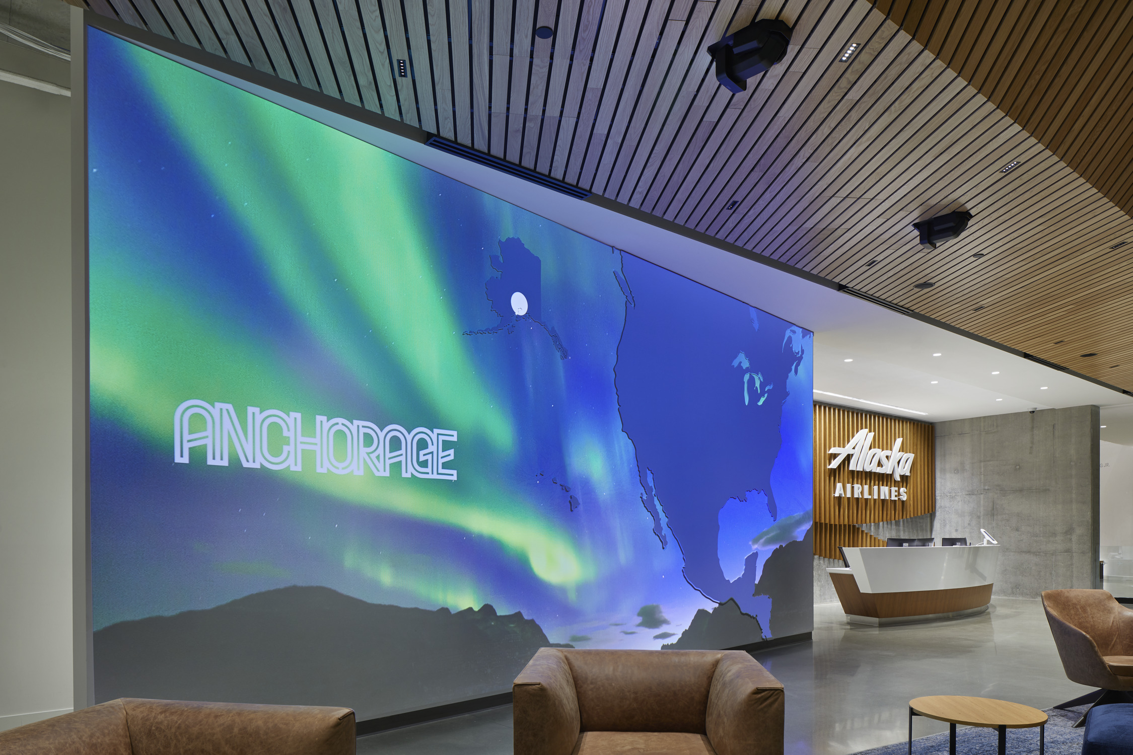
Intended to captivate audiences upon arrival, this projected wall graphic creates a vibrant, welcoming spirit for visitors to the building. The evolving and dynamic digital projection depicts the breadth and reach of Alaska’s commercial service.
We animated every route the airline takes and tallied up stats and quips about the airline’s hub cities to give visitors a sense of scale as they are welcomed into the entrance of the new headquarters. The projected digital medium allows the content to change as the organization grows. We tested paints and projector technologies to maximize contrast and vibrancy during ambient daytime light.


Exterior wayfinding includes monument signs, vertical pylons and vehicular wayfinding. Pylons are designed to allow for future modification as the campus grows and additional building destinations are added, requiring navigation.
The design is timeless and clean, with a bit of graphic flourish at the corner. The illuminated graphic is inspired by the Alaska’s brand element, the ‘Aura’.
The design is timeless and clean, with a bit of graphic flourish at the corner. The illuminated graphic is inspired by the Alaska’s brand element, the ‘Aura’.
Completed 2020 while at NBBJ
Photos by Sean Airhart
Photos by Sean Airhart
Project team:
Katie Kratzer-Smith (Lead Design)
Olin Nespor (Design)
Norman Ai (Design)
Eric LeVine (Principal)
Olin Nespor (Design)
Norman Ai (Design)
Eric LeVine (Principal)